

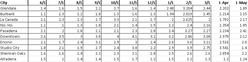
As always, the beginning of this month marks a new installment of our Los Angeles Market Inventory Report. Each month we construct this report with the intention of proving our agents, peers, and clients, with the information they need to make clear and calculated decisions based off statistical market findings.
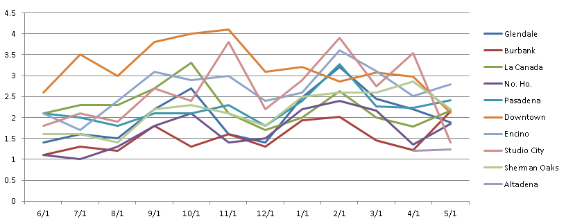
Included below is a graph and table showing the current “Months of Inventory” in the Glendale, Burbank, La Canada Flintridge, North Hollywood (No.Ho.), Pasadena, Downtown Los Angeles (DTLA), Encino, Studio City, and Sherman Oaks.
This month we have included Altadena in our study. If there is a particular city you would like us to include next month, please let us know!
In April, we observed supply decreasing quicker than demand in every market except that of Sherman Oaks and Studio city, where demand outpaced supply. It appeared that demand had increased because the inventory figures came down, but really what we were seeing was a greater decrease in supply while demand stayed somewhat constant.
Contrary to previous months, where the majority of cities would move in the same direction, in May there was no discernible pattern within the data on a month to month basis. Not happy with simply accepting the fact that the cities seemed to move independent of one another, I looked for trends based on everything from absorption rate to the geographic proximity of the cities (i.e. did Glendale & Burbank both move one way, while La Canada and Altadena moved another, etc.); however no monthly pattern revealed itself to me. Still not satisfied, I decided to take a more macro approach to the problem and looked at the data on a year-over-year basis – hoping to uncover additional information that would help explain where the Los Angeles Housing Market currently stands.
When I compared the months of inventory numbers for March, April, and May of this year to the inventory numbers for the same period of time last year, I found that the months of inventory figures nearly doubled year-over-year in almost every city!
To determine the cause of the increase in months of inventory, and to draw a conclusion on the overall health of the market, I looked at the active and sold property numbers for each of the aforementioned months in each of the cities. Expecting to find that the data would be scattered, with some increases in “actives” and some decreases in “solds” depending on the city, I was surprised to find that across the board the number of sold properties in every city remained relatively stable year-over-year – while the number of active properties drastically increased.
So, what does this tell us? Well, while we may not be able to determine a minor month to month move in either direction, we an clearly see that there are nearly double the number of listings on the market relative to last year. Furthermore, as economics 101 taught us all, markets are always moving towards equilibrium. So if there is a major increase in supply, and demand remains stable, then we should be seeing a pull back in prices as the listings on the market begin to compete amongst themselves for the attention of buyers. Imagine 20 buyers having to choose from 20 properties, and then a year later there are 20 buyers choosing from 40 properties – this is what we are beginning to see.
As this is Southern California and anything is possible, given the level of desire for property down here, saying that we will see a pull back in prices could be a bit premature; however all signs point in that direction.
In conclusion, I would speculate that with this influx of listings prices will inevitably begin to drop. Once those prices drop buyers will once again start entering the market and that beautiful ebb and flow of this industry will be restored.
Contributor, designer & admin for JohnHart Gazette.