In terms of house prices in Los Angeles County, those who were hurt the most by the market crash may not be who you expected!
As we all know home values around the country went to “hell in a hand-basket” back in 2007-08, when the market fell out, but who was affected the most?
The uninitiated, in real estate, often rely on logic when they do not understand something (which is usually a good move); however in this case logic would lead people to believe that those who have more of something would be hurt more than those who have less. Following this reason would lead one to believe that owners of high end properties would be hurt worse than owners of low end properties.
Let’s investigate and find out what really happened!
The first thing I want to make known is that there are many different criterion that one can look at when trying to determine which part of the market was effected the worst, but the I think that the “average price per square foot” is a good general indication of value, so that is what these graphs are based on.
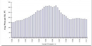
In the first graph below you can see that there is an clear bell shape curve going on, with the highest point being in 2007, and returning to almost a break even over the past 11 years.
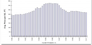
In this next graph we can see that while there is still a bell shaped curve, it is not nearly as severe as the first graph.
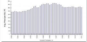
Finally, in our last graph the bell shaped curve is almost indiscernible, and in fact if it wasn’t next to the previous two I doubt anyone would call it that.
Now before I tell you, can you guess which is the lower value graph, the middle value graph, and the high value graph?
If you guessed that the the order went from top down, with the lowest at the top and highest at the bottom then you were correct. The first graph represents homes below $349k in Los Angeles County, the second is $350k to $699k, and the last is $700k and up.
From these graphs it is obvious that the worst hit was felt by the lower end properties, but while investigating I did find something interesting: the middle value range has experienced the lowest bounce back when you compare the price per square foot between 2011 and 2000. To be more precise both the upper and lower value ranges are up roughly 20% from 2000, but the middle range is only up 12%.
I would love to here your thoughts on why this may be, but my personal opinion is this: the majority of people who lost their jobs were middle and lower income employees, and since the lower income employees were already in the lower value range that is where they stayed; however the middle income employees who lost their jobs were forced to downgrade into the lower value range, which increased the demand in that market aiding in the bounce back, and causing the differential that we see.
Let me know what you think below and be sure to check out the other “Examined” articles we have written here!
After working with, and for, many different real estate firms, it became apparent to Harout that there was a major disconnect between what consumers needed/wanted and the service that was being provided to them. It was upon this realization that Harout founded and opened JohnHart Real Estate; and as the CEO/Principal Broker he has continued to break from the norm and redefine real estate with an insatiable appetite to give his clients the service and attention they deserve.


